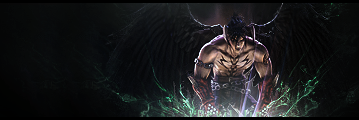
Not much critic to do. Tough it could be polished a bit. Try to do a the lighting on the guy more natural. Any other than that is great. I like the fact you kept it simple. My opinion is that you should keep working on website design.
Lightining is quite wired, but its good, i love some effects and the BG is good
Whoa! 9.9/10
a little bigger!
I find it's just a tad too dark, but I know what you were aiming for.
I remember what you're capable of, Cyanoxide. o:[/color]
Too small, border should be removed, overall effects are bland and lighting is weird.
That looks really good. I love the lightning effect.
I don't see what's so special. It's a render on a black background and some other weird fire effect.... not that good...
background needs to be better.
I like how half of you love it and half of you hate it.
There's too much darkness I think, even though I know what you were aiming for. The green is really weird, random even. The lighting is weird as well, it's on the bottom..? o-o; I like how the render is sharpened, though the part under his right arm/wing is icky to me, because you can see an outline I guess.
its ok, but you made it too small (most common criticism). if you made it bigger then it would be easier to see all of the image and see if there is anything else that could be improved or if it should be scrapped and and started over.
until its made bigger for judgement purposes i can only give it a 7/10
Like to point out that its bigger than average sig size 300X100 and that I no longer have the psd.