A preserved archive of the Logical Gamers community forums, 2009-2025. The original threads and posts, served read-only. Registration, posting and private messages are gone for good.

signatures for LGG?

917 views · started by Jesus! Muffin ·
#1
signatures for LGG?
I dont think im great but i can definitely do better than some of the signatures on here.


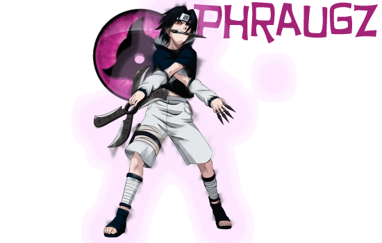
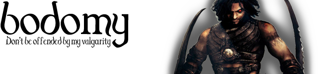


(Actually made this for an LG user back in the day)
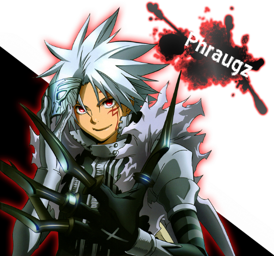


I dont have a very large portion of my art, i lost it. So this isn't half of it.
Like i said its not the best. I mostly just use a render, some brushes,
or a background, styles. i can edit photography too i guess.

50 LGG a signature i suppose.
#2
That's pretty sweet. Would you do a graffiti-themed one for me that says "323" on it? That would be really badass if you could, and I would happily pay 50 LGG.

Oh, and would you also do a Communist-themed one that also says 323 on it? I can pay another 50 LGG haha. Maybe make it look like propaganda or something :o
#3
These are pretty good i'd have to say
#4
gaianoob wrote:
These are pretty good i'd have to say


Yeah I agree, they're pretty badass.
#5
They are all right, I say use C4D's and some custom brushes. Some of these pictures don't even have a stock. The renders don't seem to blend in.
#6
I don't really like the dimensions of most of them :P
Idk if that's just me though
#7
Use wrote:
I don't really like the dimensions of most of them :P
Idk if that's just me though

I'd agree. They're pretty avatar-shaped. A sig should be wide and short. The maximum height for a signature is like 320px, I think, before the scrollbar takes over.
#8
GAMEchief wrote:
I'd agree. They're pretty avatar-shaped. A sig should be wide and short. The maximum height for a signature is like 320px, I think, before the scrollbar takes over.


I know what you and Use are saying. I made the MGK one about a week ago, the rest more then 6 months ago.
I used to make all of my signatures like that. And i know, the render sometimes doesn't seem to blend, but i mostly
just smooth the edges :p dont spend much time on something only a designer would notice. cha feel?
and ill make that for you Gamechief, 100LGG gold for 2, if you find them acceptable lol, i can't promise the
best performance but ill give it a shot.
so just one that is simply 323 as a font in graffiti, with designs around it? do you want the background transparent or do you want it white?
or would you prefer something like a brick background, or a train?

and for the communist i know exactly what you want. I would want to put a character in it although, if you dont mind,
and i want to know what you would prefer. Or would you want a bear? haha
#9
trust me, i lost ALOT of my good work over the past year. i know that artwork is very amateur, especially the sasuke one. you can see the edges, that is clear to me, i am aware lol.
#10
trust me, i lost ALOT of my good work over the past year. i know that artwork is very amateur, especially the sasuke one. you can see the edges, that is clear to me, i am aware lol.

alot
#11
Use wrote:


relevant?
#12
relevant?


learn to spellll
#13
Use wrote:
learn to spellll


learn to read
#14
what lol
#15
Use wrote:
what lol


Is it that difficult for you to comprehend the word alot? should i space it out just for you?
If it means that much to you... i guess i can spell it correctly, since it is such a bother for your
sensitive eyes to look at. but then again i dont give alot of shits.

now shoo.
#16
It's annoying when people say 'alot' because alot isn't a word
#17
Is it that difficult for you to comprehend the word alot?

I'm not familiar with this word.

A lot. Like a parking lot. If you have a lot of cars, imagine a parking lot full of cars. The place the cars are at a dealership is called the lot.

A lot is a collection of items. A is an article adjective. It's not a part of the word.

Just think of "a lot of something" as "a [parking] lot [full] of something," and it should make more sense.

A bushel of apples, a bucket of apples, a basket of apples, a lot of apples.[/full][/parking]
#18
GAMEchief wrote:
I'm not familiar with this word.

A lot. Like a parking lot. If you have a lot of cars, imagine a parking lot full of cars. The place the cars are at a dealership is called the lot.

A lot is a collection of items. A is an article adjective. It's not a part of the word.

Just think of "a lot of something" as "a [parking] lot [full] of something," and it should make more sense.

A bushel of apples, a bucket of apples, a basket of apples, a lot of apples.[/full][/parking]


No, i understand alot is not a word, or else it wouldn't be underlined when i type it.
It might be completely improper, but i don't think it is necessary to comment on it.
Maybe from this conversation, i will remember the next time i type 'alot' and think,
"Damn that grammar nazi Use might yell at me. better space it."

Use wrote:
It's annoying when people say 'alot' because alot isn't a word


Cry.
#19
I'm not mad, or sad...?
I just thought you didn't know how to spell it right, because you didn't
#20
Use wrote:
I'm not mad, or sad...?
I just thought you didn't know how to spell it right, because you didn't


sarcasm man. i don't care if how i spell annoys you.
that's what i am trying to explain to you.
#21
For the graffiti one, I was just thinking a background like this: http://creativity103.com/collections/Graffiti/Graffiti_DSC9484.jpg and then it says 323 somewhere in the corner or something like that, doesn't even have to be in a graffiti font.

As for the communist one, what character are you talking about? I was thinking a background like this (I know this is Obey, but they have the same color schemes since they base theirs off of propaganda) http://obeygiant.com/store/images/T/!!!OBEY-EYE-RESIZE-24X36-OFFSET1.jpg but long enough to be for a signature (Like wider than it is tall, like a signature pic) and then saying 323 in a font like one of these: Foreign look > Russian fonts | dafont.com
#22
For the graffiti one, I was just thinking a background like this: http://creativity103.com/collections/Graffiti/Graffiti_DSC9484.jpg and then it says 323 somewhere in the corner or something like that, doesn't even have to be in a graffiti font.

As for the communist one, what character are you talking about? I was thinking a background like this (I know this is Obey, but they have the same color schemes since they base theirs off of propaganda) http://obeygiant.com/store/images/T/!!!OBEY-EYE-RESIZE-24X36-OFFSET1.jpg but long enough to be for a signature (Like wider than it is tall, like a signature pic) and then saying 323 in a font like one of these: Foreign look > Russian fonts | dafont.com


you actually want that graffiti background? i mean it wouldn't be much except the font layer lol.. but maybe i could try to get creative,
i dont know.

and i didn't know if you wanted it like a poster, with a figure on there, like a person or something.
But i understand now. I am busy today but ill either have it tonight or tomorrow bud.
#23


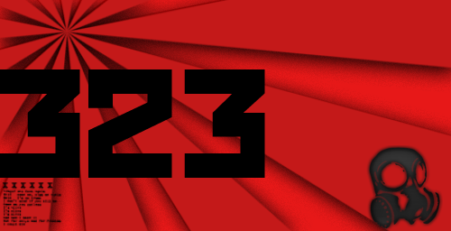
Not done with it yet, but is this the type of feel you are looking for? i can make it
look more like a propaganda poster maybe if i knew what else i could add into it.

The gas mask was just a shot in the dark, if you dont like it i will take it out lol,

but how about the rising sun in the background? and the font i used red October,
i think that will suffice.

and i am going to change the size too, dont worry.
i start all my projects out kinda large.

You want it small enough to fit in the signature without scroll bar?
#24
That's neat.

Are you using the thin LG theme?
#25
GAMEchief wrote:
That's neat.

Are you using the thin LG theme?


No, i actually dont know what you are talking about lol
#26
Very bottom left of the site. There is a drop down menu. If you change it to Wide, it'll make LG wider.
#27
Yeah i use the vBulletin usually. Why?

I like it better for some reason, unless im trying to see active posts.
#28


Not done with it yet, but is this the type of feel you are looking for? i can make it
look more like a propaganda poster maybe if i knew what else i could add into it.

The gas mask was just a shot in the dark, if you dont like it i will take it out lol,

but how about the rising sun in the background? and the font i used red October,
i think that will suffice.

and i am going to change the size too, dont worry.
i start all my projects out kinda large.

You want it small enough to fit in the signature without scroll bar?


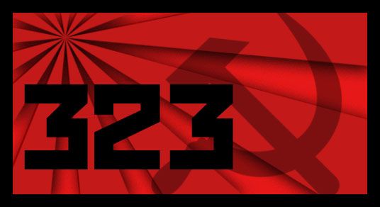
Wow, that looks awesome. And yeah, being small enough would be sweet, kinda like yours. Only thing I would say is bump over the "323" so it's not touching the very edge, but besides that it looks pretty awesome! If you wanted to make it more propaganda-like you could always make it look like a poster like this:


Of course, that's an ad for M&Ms, but see what I mean by poster-like? haha. But yeah that looks dope, even if you don't end up doing the poster thing it's still sweet.
#29
Nah bro i want to do want you want it to look like.
I can make it like a poster, but it might look really weird,
with its width being so much greater than the heighth.
cha feel?

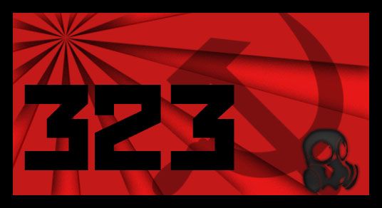
or would you like it like this? with a border

#30
I don't know if Flare wants it minimalist, but I think that exact thing but without the gas mask would look almost exactly like a real propaganda poster. At the very least, it looks like a flag. But throw on some stereotypical "fight the power" Russian-lettered message, and it'd be a flier.

Although I personally think the minimalist approach without the text would look better (less like it was trying to pack too much into too small a space; as a sig, it can't contain as much as the M&Ms poster).
#31
GAMEchief wrote:
I don't know if Flare wants it minimalist, but I think that exact thing but without the gas mask would look almost exactly like a real propaganda poster. At the very least, it looks like a flag. But throw on some stereotypical "fight the power" Russian-lettered message, and it'd be a flier.

Although I personally think the minimalist approach without the text would look better (less like it was trying to pack too much into too small a space; as a sig, it can't contain as much as the M&Ms poster).


I wanted to put some more text into it too, but this guy just wont reply too fast so i have no idea what to do :P

I dont really like the gas mask but without it i feel as though its not the kind of signature he wanted.


It looks kind of neat, definitely the feel of communism, but
what he wants is probably a red and yellow based communist propaganda poster look to it,
with the basis instead of a slogan, 323. Which is kind of difficult to make, with this little of detail.

But, after he replies one more time, i will know what to do :D
#32
You could make the sunbeams yellowish (or whatever that beigey color is) and leave the background red. Maybe move 323 to the top right and use it as a pro-revolution statistic. IDK if it has to be a single number but "3/23" being the large text and below it in smaller text "revolt" or whatever generic message.

Or "323" in big and then "people [something revolutionary]." But I couldn't think of anything that sounded like it would fit on a poster. The fuck do 323 people do? It's too specific. Maybe something other than people. "323 countries have joined. Where are you?" or whatever. It would leave the bottom left kinda plain though.

Or maybe you could leave the text bottom left and put the smaller text bottom right.

Or below the 323 if you write it small enough. Probably wouldn't look bad. It'll all fit on one line.
#33
GAMEchief wrote:
You could make the sunbeams yellowish (or whatever that beigey color is) and leave the background red. Maybe move 323 to the top right and use it as a pro-revolution statistic. IDK if it has to be a single number but "3/23" being the large text and below it in smaller text "revolt" or whatever generic message.

Or "323" in big and then "people [something revolutionary]." But I couldn't think of anything that sounded like it would fit on a poster. The fuck do 323 people do? It's too specific. Maybe something other than people. "323 countries have joined. Where are you?" or whatever. It would leave the bottom left kinda plain though.

Or maybe you could leave the text bottom left and put the smaller text bottom right.

Or below the 323 if you write it small enough. Probably wouldn't look bad. It'll all fit on one line.


yeah ill fuck with it some more tomorrow. But i can definitely find some more text to add,
i just dont know what. Maybe he will be satisfied with just making something in the signature yellow.
Or something like that. I dont know. I bet i could make a pretty good propaganda poster though honestly :D